Problem
There are different types of content you may be looking for in search engines. Private Search have had all search results similar before update. The problem with that was that users should read each result and spend some time to choose the result they are looking for.
Solution
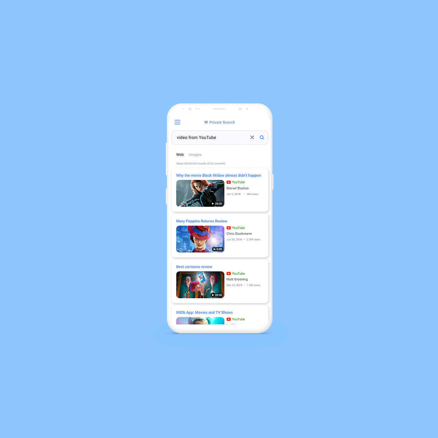
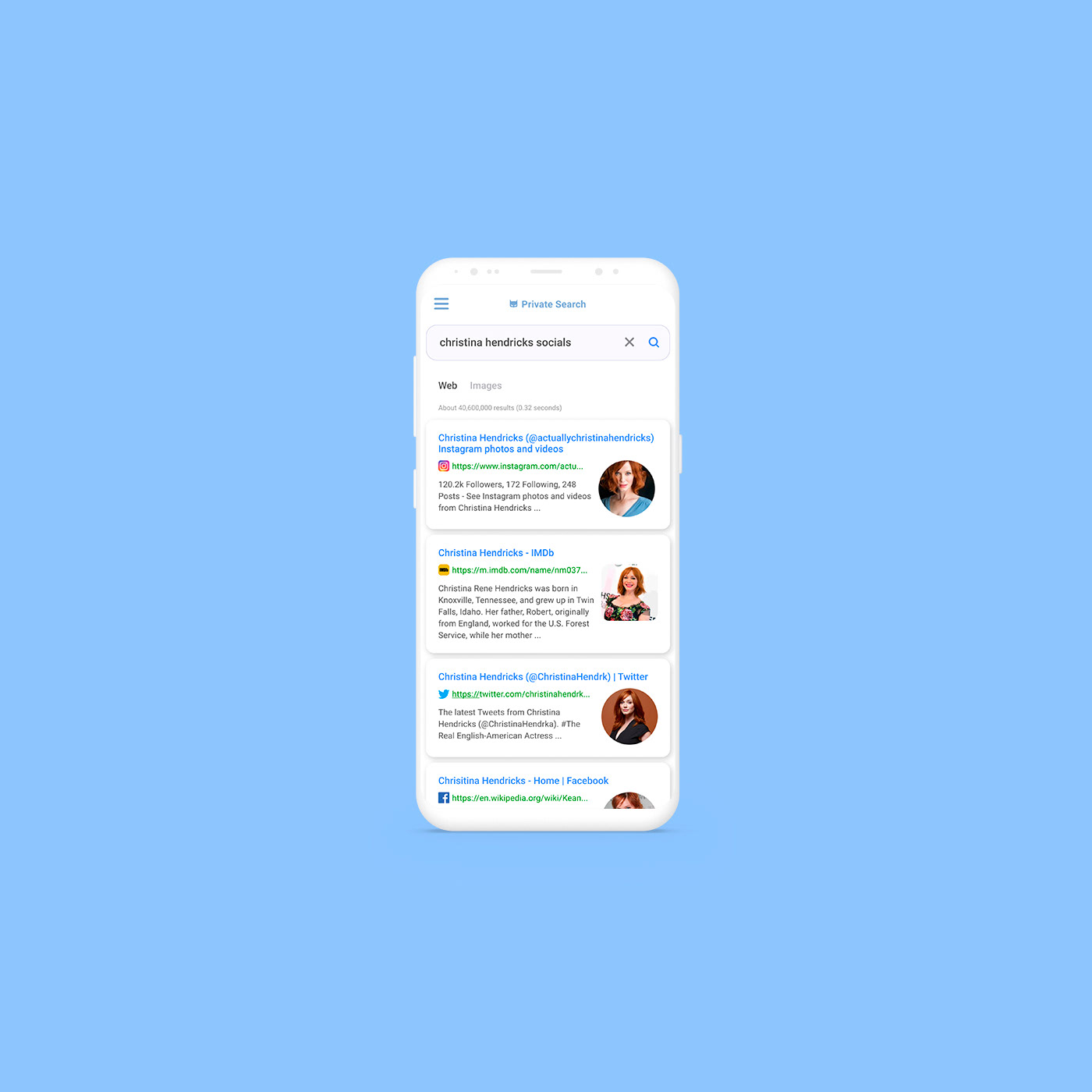
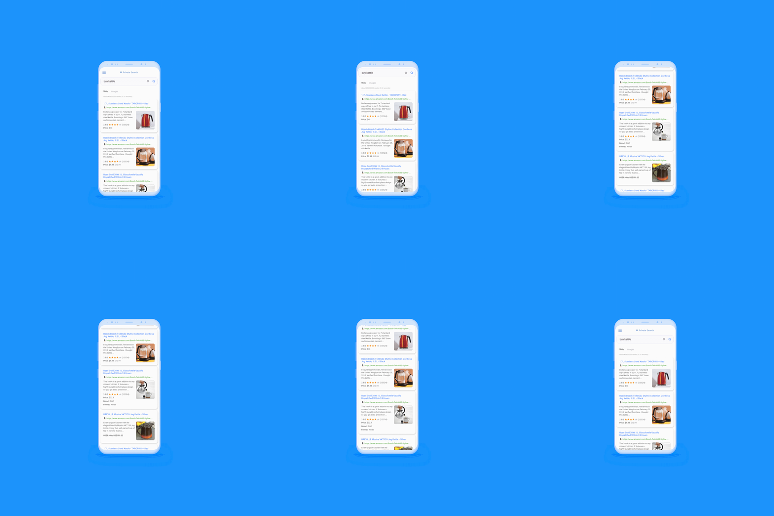
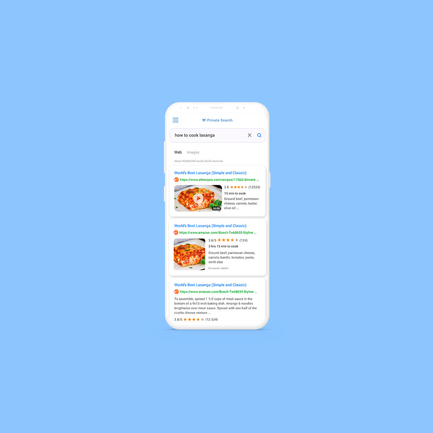
To guide users faster through results I redesigned search results into visually clear snippets. It allows quickly scan through results and find those you need, is it link to social profile, or video from YouTube, or app from App Store. Whatever it is, user can quickly understand what kind of content he or she expects to open and choose the right one for him/her.
Process
UX Research first. To understand best practices I've collected and analyzed more than 200 pages from the most popular search engines (both desktop and mobile) and studied data Nilsen Norman Group provides about search results and SEO.
As the result I was able to identify certain patterns for different search results and improve existing Private Search's results. For example users have already used to roundeds avatar previews from socials, so in search results I've designed avatars previews the same way.
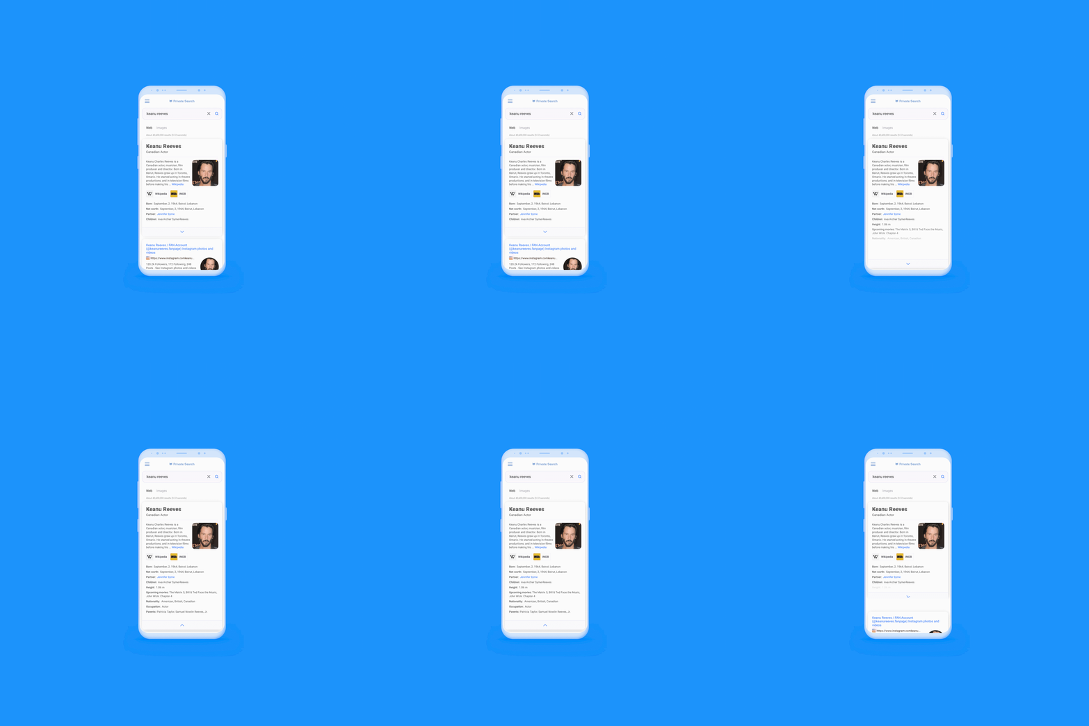
Started from mobile. Below are the first result of Wikipedia snippets design.
Started from mobile. Below are the first result of Wikipedia snippets design.
Result
